Introducing the Louisville Data Journal
And some data about internet access
Local Data Journalism
Local journalism is important. This newsletter is my way to contribute what I can to providing local news for my community. I am, by training, a data scientist, and so data journalism feels like the right type of journalism for me to pursue.
I studied public policy at the University of Kentucky, so I expect much of my analysis to focus on policy and politics, though I may also cover some other topics, like sports and culture.
I’m not yet sure how often I’ll be able to write. I expect that most of the time I’ll be working on data features and then publishing them when they’re ready. I know a set writing cadence is better for audience growth, but such is the nature of side projects.
The writing below about internet access is not a full data feature. Instead, I’ve pulled a bit of data in order to test out the substack platform (Update: I have since migrated to Ghost). It looks like my options for visuals are essentially only Datawrapper for interactive and the ability to upload images, so I’m testing both here.
Internet Access
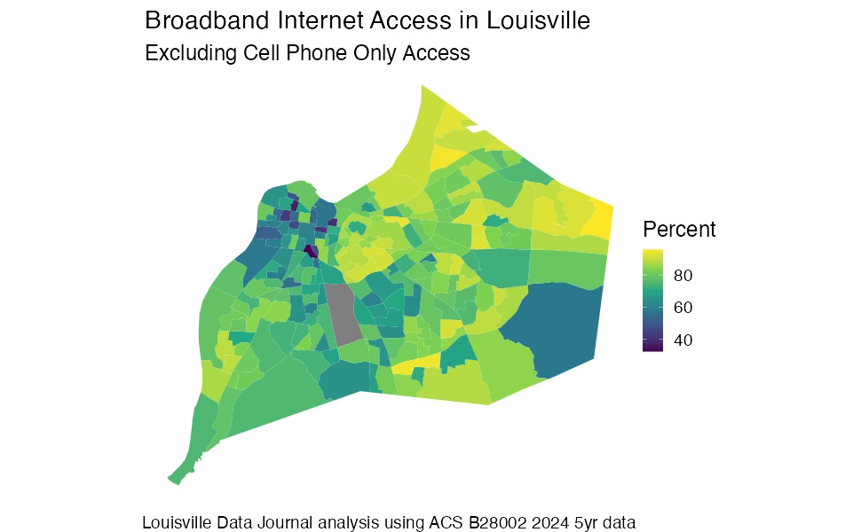
With schools closed for the past week due to winter weather, it’s a good time to remind people that about 1 in 5 households do not have broadband internet access (not counting cell phones) and that access is not evenly distributed.
The map below shows Louisville at the census tract level. If you have, for some reason, looked at a lot of data maps of Louisville (welcome fellow nerds!) it will look depressingly familiar. Maps of poverty, race, health insurance, and most data we have at the neighborhood level all tend to take on the same basic pattern. This is, of course, not coincidental and deeply rooted in Louisville’s history and public policy choices. But we can start chipping away at some of that in later newsletters - for now just note that internet access follows the same pattern.
Here I’ve defined internet access to mean access to some sort of broadband that is not just a cell phone.
For interactive visuals on substack, Datawrapper appears to be the only option. This is my first time using it, and it seems like it has enough flexibility to do most of what I want, but I suspect I will also at least sometimes want to make static graphs as well.
A downside of static graphs is that you can’t put extra information in the tooltip, although for people who want the data you can always post a view only spreadsheet link so people can access or download the data themselves.
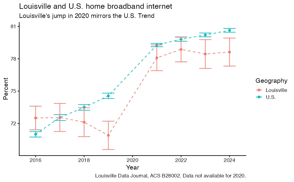
Internet Access Over Time
Home internet access did go up during the pandemic. Although we don’t have data for 2020 due to Covid shutting down the American Community Survey for that year, we can see a large jump between 2019 and 2021. Large changes like that always make me suspicious that there might have been a change in the survey wording or administration, but I do not find any changes in Census documentation, and the jump is consistent with both with a similar jump in the U.S. and with what we might expect to happen as a result of the pandemic shutdown.
One limitation of Datawrapper is that it does not support error bars, which are nice to be able to incorporate when dealing with survey data. Here we can see that in 2016, Louisville was ahead of the national average in terms of internet access, it did not jump as much as the U.S. average and is now slightly behind the national trend.
There’s a lot more to potentially be said about internet access, but the main goal here was just to provide a bit of data and introduce the newsletter rather than a full deep dive.
I’m also interested in what people would like to hear about or have data related questions about, so feel free to drop a question in the comments if there’s something you’d like to know more about and I’ll see if I can find some data on it.